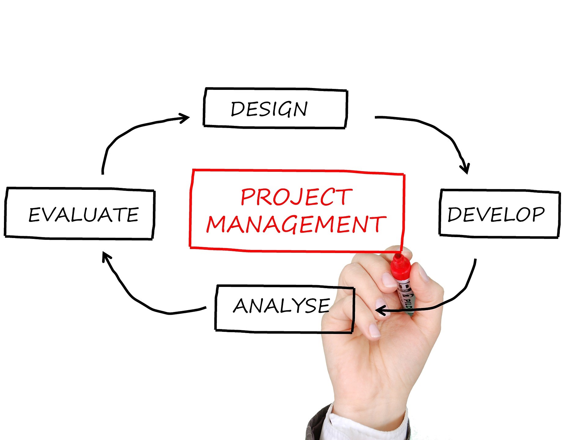
An increasing proportion of organizations now rely on the agile project management framework. Under this framework, companies use activity-based dashboards to share information digitally. Such a framework empowers organizations to stay on top of projects to understand better how each task ties into a more extensive project timeline. Because of how user-friendly the dashboard is, professionals can easily access resources pertinent to their project’s completion and seamlessly incorporate them into their performance objectives.
Dashboards may be the way of the future regarding project management, but they have ways to go before they are commonplace. The Harvard Business Review recently conducted a survey where they acquired feedback from 25 practicing project managers across a diverse scope of industries. The results showed that project managers depend on their agile project management framework via a dashboard on a nearly daily basis. However, close to 75% of the study’s respondents reported that their dashboards did not yet have the tools they needed to ensure their project’s success.
Dashboards are not entirely foolproof, but they are effective. Plus, the more familiar and innovative the world becomes with technology, the more we can expect a continuation in the positive tweaks to dashboards overall. If you are convinced that an agile project management framework in the form of a dashboard template would work for your team’s strategy, then you are in good company. Here are some tips for using the intersection of digitalization and project management to build a dashboard that meets your goals.
Why dashboards?
Dashboards offer advantages from both an aesthetic and an analytical perspective. For example, a well-designed dashboard shows professionals contemporary, relevant numeric data that speaks to your organization’s key performance indicators (KPIs). By presenting this information visually, stakeholders can benefit from having a high-level view of project metrics.
Thanks to dashboards, project managers can have their day-to-day operations dramatically simplified because dashboards easily display variance between the actual and expected metrics within process breakdowns. Interactive dashboards also incorporate tabs for user navigation, where project managers can access detailed information on cost drivers over time.
Thanks to the new digitization era, the underlying components of dashboards have also strengthened. Descriptive data sources, real-time data feeds, and a commitment to user experience and data visualization lie at the foundation of how we use dashboards in project management. And because we now rely more on technology than ever before, improvements to the core of why dashboards work have made an agile project management framework more of an organizational priority.
Learning from dashboard limitations
Not all dashboards are created equal. When building your organization an agile project management framework, you will realize that implementing a dashboard is not a one-size-fits-all solution to the project management woes you may still need to navigate. But before you take on the task of building a dashboard for your team, consider some generalized limitations we have seen from agile project management frameworks so that you can realistically set your intentions.
It is undoubtedly a net positive to have as much data on a project available as possible. However, knowing how to leverage user experience in communicating that information will determine whether your dashboard reaches its potential. While dashboards effectively guide entry-level and mid-level team members throughout the project management process, newly released research suggests that managers and executives struggle to extract fuller potential from dashboards. That finding suggests that business leaders have difficulty achieving a balance between dashboards that focus solely on operational or financial indicators with those that hone in on specific key performance indicators.
The suggestion that executives and managers struggle to interpret all of the data presented in a dashboard speaks to another standard limitation of this framework. Often, dashboards can include too much data. Having too much data visible in one place can foster feelings of information overload. Should your agile project management framework include too much information with little throughline on how these metrics relate to the bigger picture, your team may find decision-making a challenging goal to achieve.
About Krishen Iyer
Krishen Iyer is a successful California-based entrepreneur with expertise in digital marketing. He graduated from San Diego State University with a bachelor’s degree in public administration and urban development. Shortly after his graduation, Iyer began working with insurance distribution centers to manage their lead traffic and build their brand recognition. Today, Iyer continues to draw on that hands-on marketing background with insurance agencies via his firm, MAIS Consulting Services. The firm, headquartered in Encinitas, consults health and dental insurance clientele on their marketing and contracting strategies.