After being on backorder for months, my Moto Razr arrived on March 30, 2020. It was beautiful. Motorola had perfectly captured the essence of old-school Moto Razr design and updated it with futuristic folding display technology. While it was still an impractical flip phone, it was fun and cool and different. The Moto Razr was something I was excited to write about.
But my Razr was not long for this world. Straight out of the box, every fold was accompanied by a groan or creek from the hinge system. I would later learn that these noises were cries of agony—every actuation brought the smartphone closer to death, as if little bits of lifeforce were leaving the phone with every flip. First, the phantom touch inputs started. While the phone was opening and closing, apps would mysteriously startup. Buttons would press themselves. Things were not good.
“This is fine,” I thought. “Opening and closing the phone only happens for a very short amount of time. Once it opens and everything settles down, things are fine.” Things were not fine for very long, though. These phantom touch inputs were the death throes of the flexible OLED panel, and soon they started even when the phone was open and stationary. Sometimes I could open a multitouch test app and watch as touchpoints danced across the screen. Opening and closing the phone one or two more times would usually clear up these errant touch inputs, and things would be fine again.
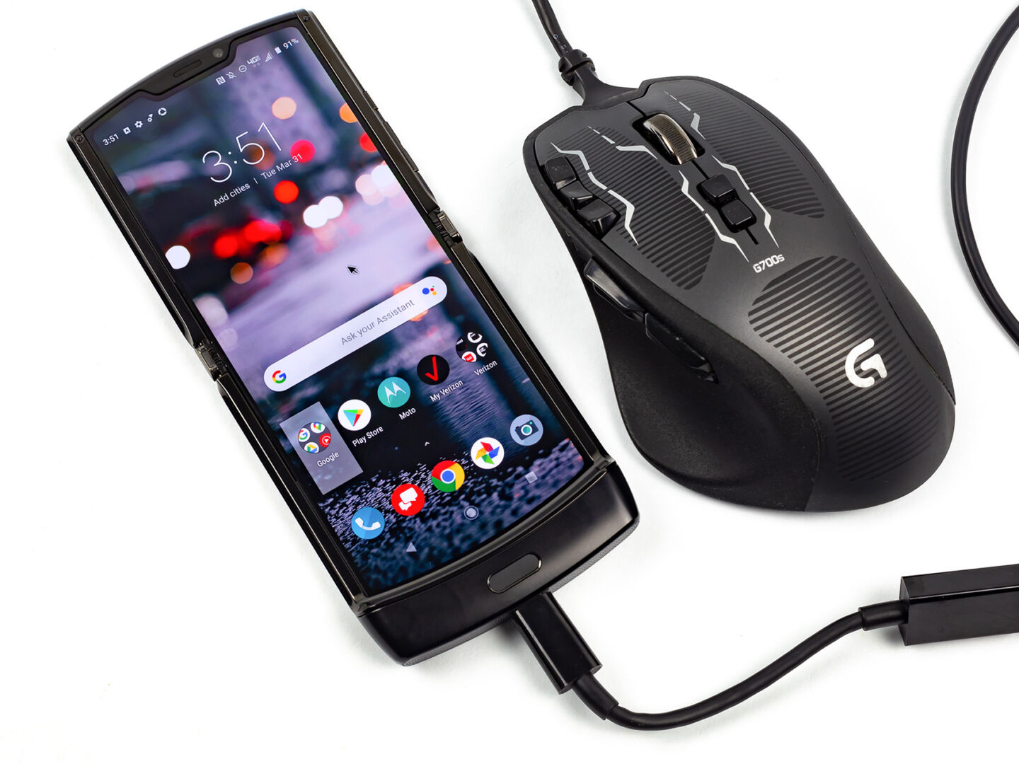
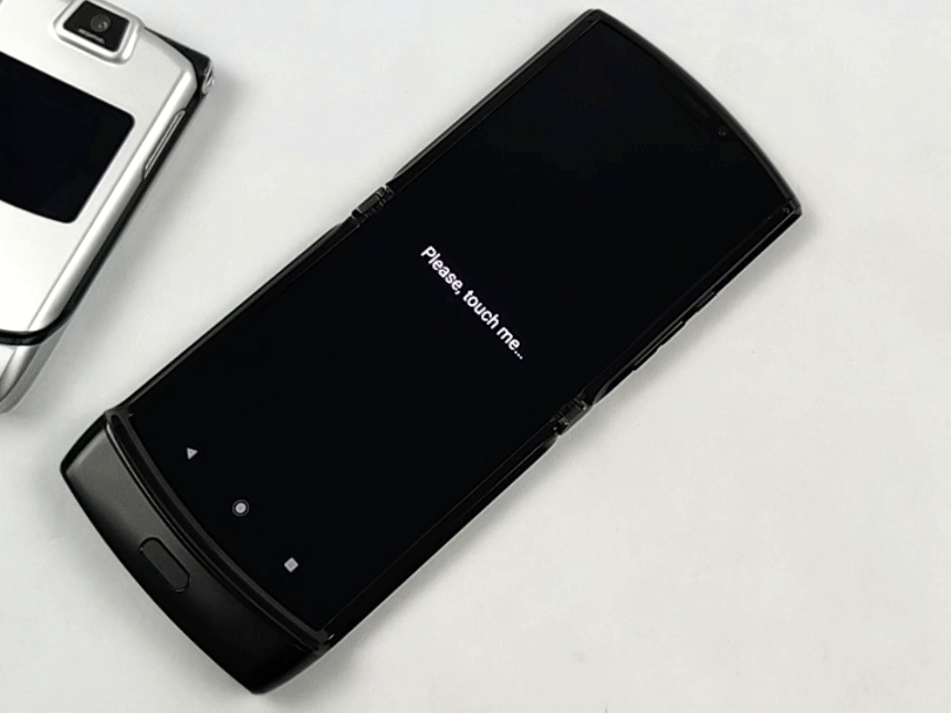
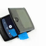
Sadly, evaluating a phone requires opening and closing it regularly. And with more openings and closings, the phone continued to deteriorate. Eventually, the touchscreen stopped working above the halfway point. Now the phone has two modes when you open and close it: you either get a completely dead touchscreen or the phone turns into a possessed demon that randomly pushes buttons at about 10 actions per second. This all happened within the first 24 hours of using it. So as pictured above, I spent most of this review limping along by controlling the phone with a USB mouse.
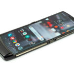
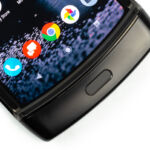
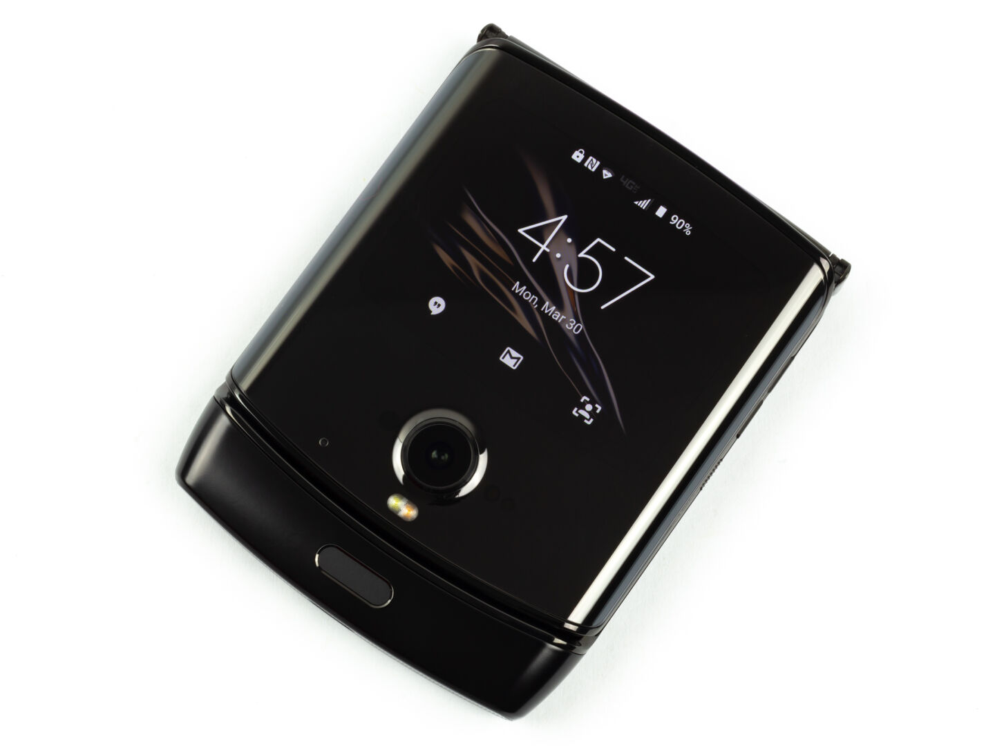
Every decision Motorola made with the display of the Razr is pretty novel. The phone is designed to close with no gaps and to not put a hard crease in the display, which means a wildly complicated hinge system. The mechanical structure of the hinge isn’t behind the display—on the left and right side of the display, the phone bezel is interrupted by tiny gears, which handle the opening and closing. Around the hinge area, support plates under the display swing out of the way as the phone closes, leaving a pretty large void behind the display. This allows the screen to fold up into a loose loop instead of a hard crease.
The lack of a hard crease doesn’t mean there aren’t any weird light reflections in the middle of the screen. You can see where the moving support plates are under the display since they don’t create a smooth surface. While the top and bottom are as smooth and flat as you would hope, the entire middle third of the display sinks into the collapsible support structure. You can feel all sorts of bumps and potholes in the display as you glide your finger across it.
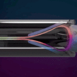
The bottom half of the display is not attached to anything and just kind of floats around. The whole bottom half of the display actually moves when the phone opens and closes—it slides in and out of the bottom chin, and when the phone is open, the display is pulled tight over the backplate to keep it in place. This doesn’t work very well compared to bonded glass, and the bottom half of the display likes to float above the backplate slightly—you’ll press down on the display, and then the display will lower a bit and hit the backplate, like you’re pressing down on a big bubble. The sides of the display are exposed, and you could easily get something under the display and ruin it. Some of my camera angles even picked up components on the inside of the phone, which you can sometimes see through the display panel gap.
| SPECS AT A GLANCE: MOTO RAZR | |
|---|---|
| INSIDE SCREEN | 6.2-inch, 2142×876 OLED display
(373ppi, 21:9 aspect ratio) |
| OUTSIDE SCREEN | 2.7-inch, 800×600 OLED display
(370ppi, 4:3 aspect ratio) |
| OS | Android 9.0 Pie |
| CPU | Eight-core Qualcomm Snapdragon 710
Two Cortex A75-based cores at 2.2Ghz, and six Cortex A55-based cores at 1.7GHz |
| RAM | 6GB |
| GPU | Adreno 616 |
| STORAGE | 128GB |
| NETWORKING | 802.11b/g/n/ac, Bluetooth 5.0, GPS, NFC |
| PORTS | USB 3.1 Gen1 Type-C, 3.5mm headphone jack |
| CAMERA | 16MP |
| SIZE | Unfolded: 172 x 72 x 6.9 mm Folded: 94 x 72 x 14 mm |
| WEIGHT | 205g |
| BATTERY | 2510 mAh |
| STARTING PRICE | $1,499.99 at Verizon |
| OTHER PERKS | front fingerprint sensor |
This hinge is clearly what’s been destroying my Razr from within. From what I can tell, the Moto Razr arrives in a virgin state, having never been folded, and it’s up to you to break it in. Presumably, this also means individual units don’t undergo any testing to see if they are actually built correctly or if they can survive everyday life. My unit really seems like something that could have been caught in the factory if someone just tried closing it a few times and made sure the touchscreen was OK. Again, it started showing problems after just a few folds.
Usually, the driving force behind foldable OLED displays is Samsung, the world’s leading display manufacturer, but Motorola’s supplier for the Razr is BoE, an up-and-coming display rival from China. Samsung made a huge improvement in flexible display with the debut of flexible glass in the Galaxy Z Flip, but the Razr still uses a regular, squishy, plastic display. BoE’s display isn’t very good. It’s not that bright, and the strangest thing about it is a cloudy reflection whenever the light hits it.
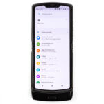
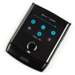
Opening these flip phones is a much bigger barrier to entry compared to just turning on a ready-to-go slab smartphone, so it’s important that they have some kind of front screen for quick tasks like checking the time or your notifications. The Razr is equipped with a 2.7-inch, 800×600 front display, which should be big enough to get some simple tasks done. Unfortunately, you’re limited in what you can do by a weird custom UI that Motorola built.
Motorola calls the front display “Quick View,” and it’s about as limited as a smartphone lock screen. You’ll see the normal status bar icons at the top, then the time, then a list of notification icons at the bottom.
You can’t swipe down from the top of the screen to see the notification text. Instead, you can either long-press on each individual notification icon to see the text, or swipe up on a notification icon to open a custom version of the notification panel. Rather than the normal single pane, vertically scrolling notification list, Motorola changed everything with a horizontally scrolling, paginated notification view that shows one notification per swipe. Paginated UIs are slower to navigate than flickable, vertically-scrolling panes, so this isn’t a great change.
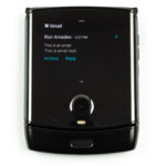
The notification UI for the front display was built using the notification access API, which is normally used for smartwatches, so you’re limited to the usual smartwatch features. That means notification text and action buttons make the jump to the front screen, music controls automatically work, and you can do things like reply-by-voice to text messages. Motorola’s decision to reinvent the notification panel also means you’ll be losing some features, like the ability to launch apps, snooze notifications, and block notifications.
You can swipe down from the top of the screen to get a UI that looks just like the quick settings, but isn’t the quick settings. You can’t customize it and there are only six icons: Wi-Fi, data, Bluetooth, tethering, camera, and flashlight, along with a brightness slider at the top.
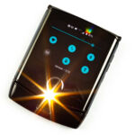
The flashlight button—I don’t understand this—is it for a practical joke you can play on your friends? Of course, the flashlight button turns on the camera LED, but this is a flip phone, so when you’re using the front display the camera and LED is pointed at your eyeballs, so the flashlight button just blasts you in the face and blinds you. And this LED is painfully bright—you’ll see stars for a bit afterward. I guess you can try and press the button while not looking at the display, but that is pretty hard, and then you’ve still got to turn the flashlight off at some point, so good luck doing that without being blinded. I guess you can cover the LED with your hand? What was Motorola thinking on this one?
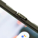
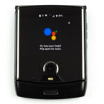
The last bit of functionality on this screen is the Google Assistant, which you can bring up by saying “OK Google” or by double-pressing the power button. You’re limited to verbal responses from the Assistant only though—no visuals, which is a bummer and seems unnecessarily limited.
Google’s Android Compatibility Definition Document only requires a 2.5-inch display to run Android, so the Moto Razr’s front display is actually big enough to run the normal Android UI. There was no need for Motorola to reinvent the wheel here. Normal Android would have worked and been more functional. It wouldn’t require usage instructions. It would let users customize things like the quick settings. It would let them run simple apps like a calculator without any problems. The Google Assistant could display visual results, and users could do things like scroll through music playlists from the front display.
Everything about the front display would have been better if Motorola just left Android alone. The custom UI doesn’t do anything better than normal Android and doesn’t add any new features. It’s just pointlessly restrictive.
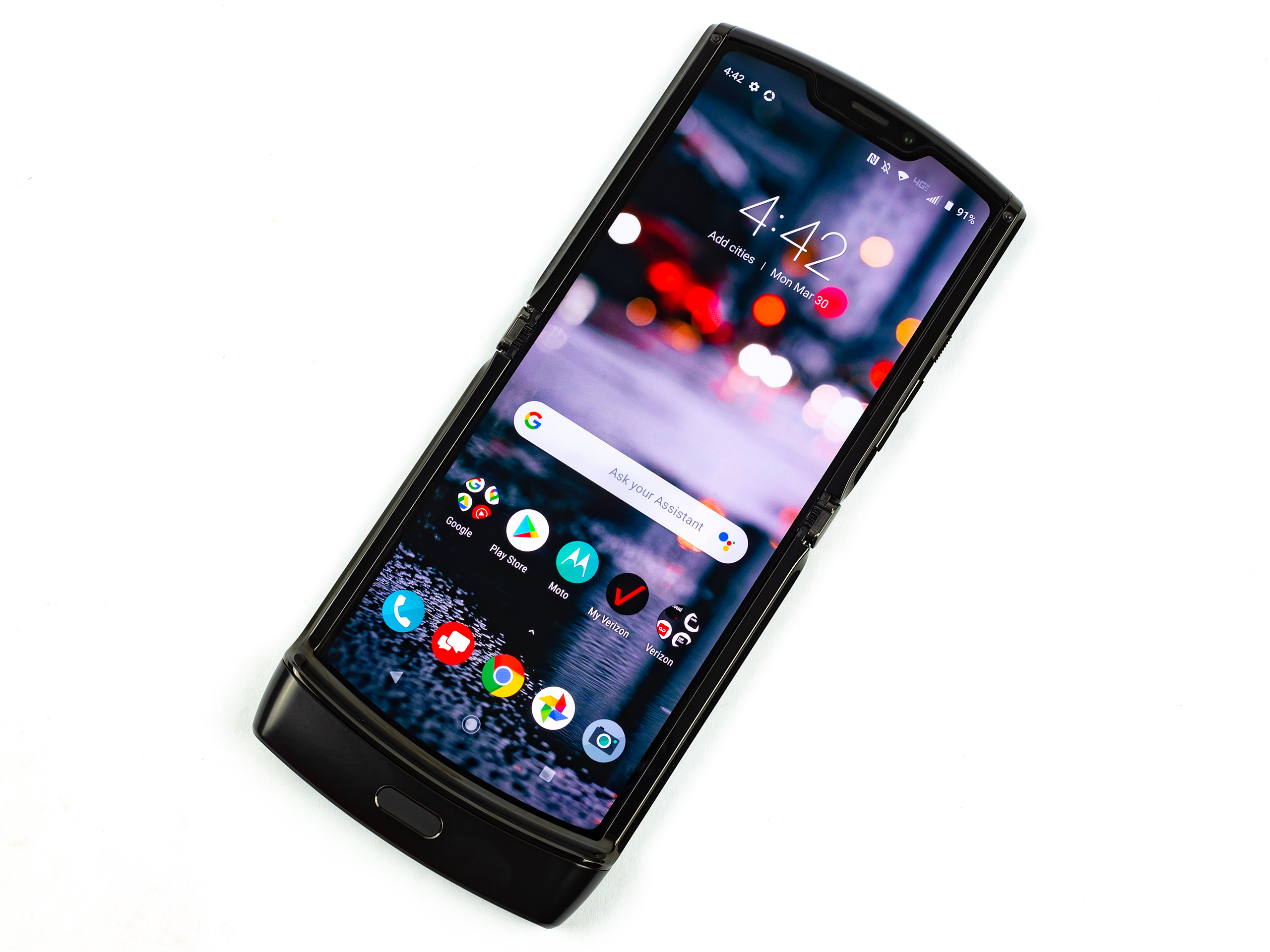
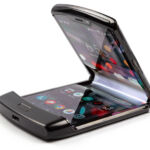
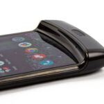
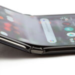
It’s really a shame this phone is an engineering disaster, because it’s very pretty. Motorola did a great job bringing the old school Moto Razr design into the current era. The phone just oozes style.
These flip phones aren’t that practical compared to a slab smartphone—the need to open them every time you want to do something substantial, and that means one-handed usage is a lot harder. If these flip phones are going to succeed, I think it will be as a novelty, and the Razr absolutely nails “novelty.” Samsung’s Galaxy Z Flip is an excellent comparison point here: It feels like there was barely any design work done on the Z Flip. Samsung took the regular, boring Samsung hardware design, folded it in half, and called it a day. The Z Flip is actually pretty boring and ugly looking.
The Razr design, on the other hand, has had a ton of work and love poured into it. Just look at the interior display as an example. All it needed to be was a rectangle, but instead Motorola came up with the crazy display shape that fills every crevice of the interior design. The top and bottom edges of the display are sculpted into an arc, instead of the normal straight lines. Motorola somehow even made a good looking display notch at the top.
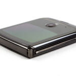
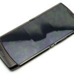
The Razr looks great when it’s closed, too. While the Z Flip is just kind of two bulbous halves of a Samsung phone clumsily stacked on top of each other, the Razr looks like something that is meant to fold up. The two halves of the phone come together to form a single shape, with tapered sides and a top half that folds flush with the bottom chin.
The phone measures only 7mm thick when open, and it seems like Motorola has to make a lot of sacrifices to get the phone this thin. The first clue is that, despite the crazy $1499 price tag, the Razr is specced like a mid-range smartphone, with only a Snapdragon 710 SoC, a 10nm chip introduced in mid-2018. Look at these terrible benchmarks.
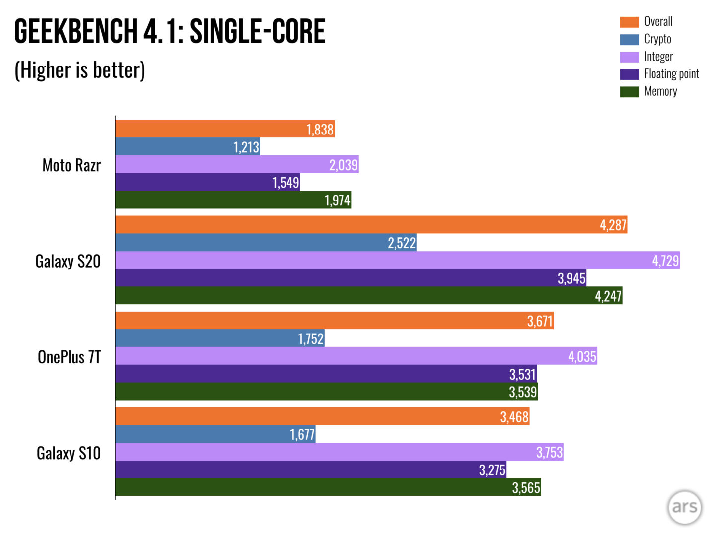
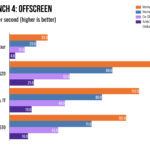
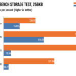
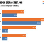
Don’t expect flagship-level performance out of the Moto Razr. The Nokia 8.1 is a great comparison on this aspect: same size screen, same SoC, same RAM, same storage, but the Nokia phone is $410. You’re paying about $1000 for the Razr’s good looks, and that’s not even mentioning the extra camera, headphone jack, MicroSD slot, and the 40 percent more battery provided by the Nokia.
Thanks to the defective touchscreen, I can’t get the phone to sit still long enough to run a battery test, but rest assured, the battery life is terrible. First, the 2510mAh battery sounds small because it is small. A lot of space in the Razr is taken up by the hinge system—space that would normally be used for battery. And for these flip phones, remember, you’re splitting the battery in half between the top and bottom of the phone. The second problem is that the Razr seems to just drink battery even when it’s sitting there, closed, in standby. I’ll lose about 15 percent battery idly sitting overnight.
I can’t say the Razr’s durability issues are a surprise. The second this phone hit the general public, it started falling apart. Still, my unit seems to be worse off than others. I would have loved for the phone to survive 27,000 folds, like Cnet’s testing showed. Mine was good for about 10 folds before it started showing problems.
Even if the phone didn’t disintegrate every time you use it, there are just so many show stoppers with the Moto Razr. The plastic display is fragile, squishy, and doesn’t feel securely attached to the device. The hinge mechanism is a noisy, grinding, groaning mess. The phone costs way too much for the mid-range internals, especially when Samsung is selling a high-end flip phone for the same price. The UI for the cover display unnecessarily re-invents the wheel, when normal Android would have been fine. Motorola’s software is more crapware than operating system. It’s also out of date now, and don’t expect an update anytime soon.
On top of all that, there’s the overarching issue that flip phones are not a great idea and less practical than regular slab smartphones. Needing to open and close them everytime you want to do something serious means one-handed usage is a lot harder than on a slab phone. Needing to open the phone is slower and a significant barrier to entry, which is a problem when we all check our smartphones dozens of times a day. The Razr’s battery life is terrible, and that’s another avoidable negative inherent to the flip phone design. (That hinge takes a lot of space away from the battery, too.) And of course, flip phones are ludicrously expensive thanks to the cost of a folding display and hinge system. This is a $1400 phone and about $1000 of that goes to all those flip phone parts.
In my experience, there currently aren’t any serious advantages to a flip phone either. Flip phones are the same as slab phones when they are open. You don’t get the benefit of something like a Galaxy Fold, which turns into a tablet. The only advantage is a different configuration in your pocket.
Now, the Razr isn’t completely without merit. Motorola did an amazing job on the look and feel of the device, and if it weren’t a complete engineering disaster, it would be an attractive, appealing phone. It’s not as practical as a slab phone, but I think some people would be willing to overlook that because it’s just so cool. That’s if it worked, though, and it doesn’t.
The Razr feels like a fake product. It’s back-ordered for a month at a time, the distribution is extremely limited, and even when you get one, it’s broken. From the very first leaks, the phone seemed like it was too good to be true. Motorola has proved it was—and that the company just can’t pull something like this off.
 +1-786-628-7980
 Sign Up/Sign In